The Ultimate Banker’s Guide to User Experience
User experience is single most important thing for you to keep in mind during the digital revolution. How is the banking industry doing on this front?
User experience is single most important thing for you to keep in mind during the digital revolution. How is the banking industry doing on this front?

As the digital revolution blazes onward, it becomes clearer than ever that the customer holds the reins today. “Customers feel empowered,” writes Micah Solomon, author of Your Customer Is the Star. “It’s not just that they know they’re always right. They also know they always have a voice due to all of the social media options at their disposal if you forget that they’re always right.”
Combine this social media presence with increased choices and decreased switching costs, and it's easy to see why banking in the digital age requires you to put the customer first. As Daniel Makoski, Chief Design Officer at Lloyds Banking Group, says, “We need to reimagine our digital future from the perspective of customers.” Simply put, this is the single most important thing for you to keep in mind during the digital revolution.
How is the banking industry doing on this front? Are consumers happy with their experience? Do they feel like the banking industry fairs well compared to other industries?
The Truth Is...
Financial services companies have made enormous improvements on this front. For instance, when it comes to customer experience, the Qualtrics XM Institute surveyed more than 10,000 consumers and found that the banking industry “has improved their benchmark rating more than any other industry,” rising to third place of the 20 different industries they’ve surveyed over the past nine years.
This finding is also supported by research from Cornerstone Advisor Ron Shevlin, wherein he shows that of all the people in the US who opened an account with a challenger bank, “just 2% did so because they didn’t like their current bank.” It might be surprising, given the animosity people expressed toward the banking industry in the wake of the 2008 financial crisis, but it seems that people today generally like their primary bank (or at the very least feel agnostic toward it).
Still, there’s a long way to go to fully optimize the user experience in banking. Traditional lenders can’t risk complacency, since millions of people are opening bank accounts with digital banks such as Wealthfront, N26, Monzo, MoneyLion, and Chime to enjoy the benefits of better money management tools, higher savings rates, easier loan processing, and more.
To more fully understand the state of user experience in banking, we surveyed more than 1,000 random people in the United States — asking them the same questions we asked in a 2015 survey, so we could start to map trends over time.
Here’s what we found:
First, we asked people which is more important to them: A simple and easy digital experience, or a friendly and helpful staff. In both cases (2015 and 2020), people overwhelmingly — by a factor of more than 2 to 1 — said they preferred a simple and easy digital experience. However, perhaps surprisingly, the number of people saying they prefer a friendly and helpful staff rose slightly from 29% in 2015 to 32% in 2020. It’s clear, in other words, that even with the best digital technology on hand, you can’t afford to disregard the human touch.
 MX Research, Survey of 1,010 random US consumers
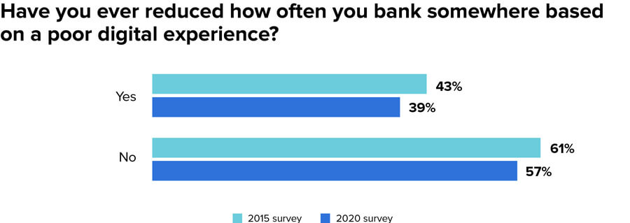
We then asked people if they’d ever reduced how often they bank somewhere based on a poor digital experience. Roughly 40% said they had, with 43% saying so in 2015 and 39% saying the same in 2020. This response underscores just how essential the digital experience is for traditional institutions. After all, if 40% of people have reduced where they bank because of digital, it’s clear that treating digital as an afterthought means you’re putting yourself at risk for major revenue losses over time.
 MX Research, Survey of 1,010 random US consumers

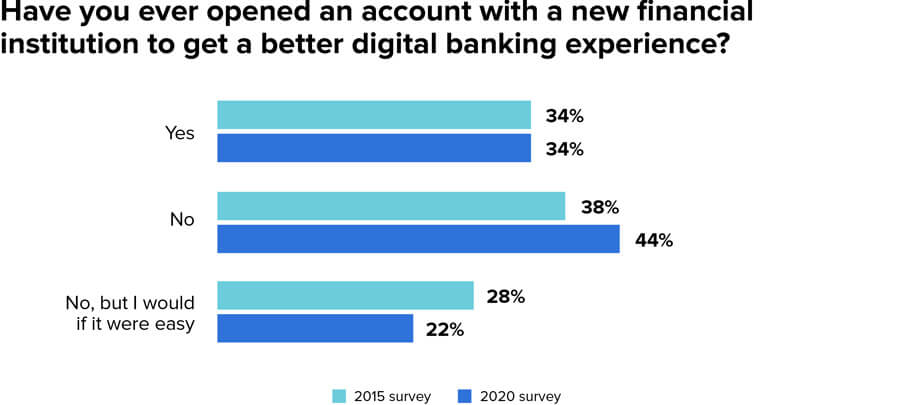
Next, we asked respondents whether they’ve ever opened an account with a new financial institution to get a better digital banking experience. In both instances (2015 and 2020), a third of respondents (34%) said they had. Following the trend that people are happier with their bank today, the number of people saying they haven’t opened a new account for this reason but would if it were easy dropped from 28% to 22%. In other words, people are more satisfied with their financial institution than they were five years ago, but the same percentage are still opening new accounts, indicating ongoing curiosity about new digital offerings. In light of this, you should ask: Is your organization pulling people in or pushing people away because of the products you offer?
 MX Research, Survey of 1,010 random US consumers
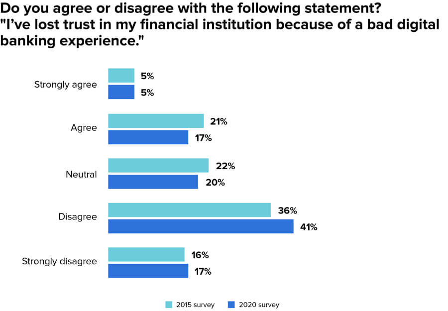
When it comes to whether people have lost trust with their financial institutions because of a bad digital banking experience, 5% say they strongly agree and 17% say they agree, while 20% feel neutral about it. More than half say they disagree (41%) or strongly disagree (17%). At first glance, it might seem like financial institutions have nothing to worry about on this front, but in reality, losing the trust of roughly a quarter of your customers based on a bad experience is nothing to treat lightly.
 MX Research, Survey of 1,010 random US consumers
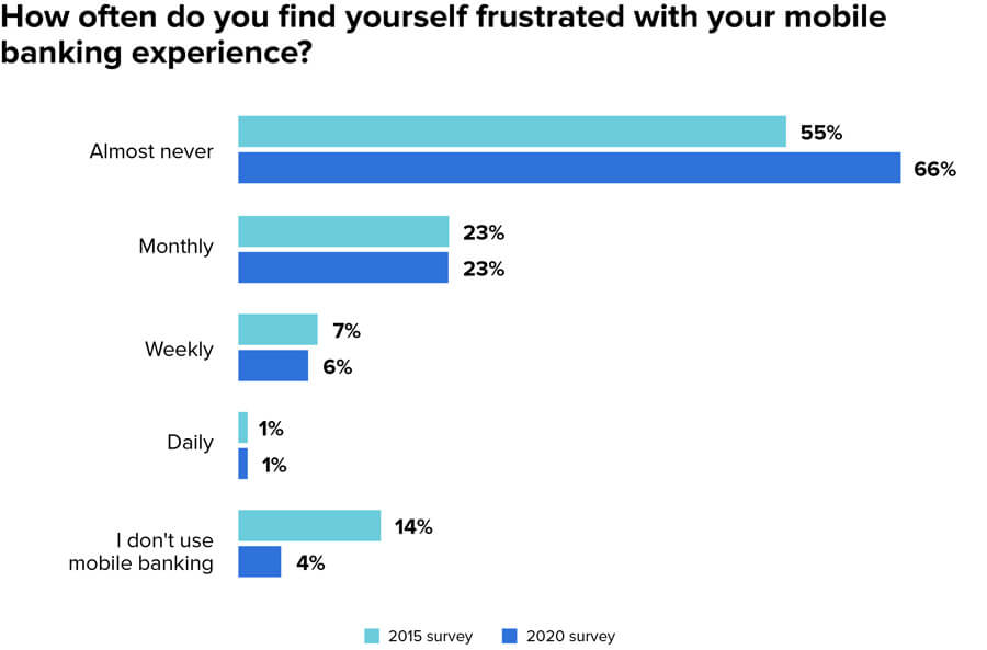
People are less frustrated with mobile banking since 2015 and mobile usage has sharply increased. Specifically, the percentage of people who say they’re almost never frustrated with their mobile banking experience rose from 55% in 2015 to 66% in 2020, and those who say they use mobile banking rose from 86% to 96%. Given that this means nearly 100% of the population now is now a mobile banking user, it makes more sense than ever before to invest heavily in getting mobile right.
 MX Research, Survey of 1,010 random US consumers
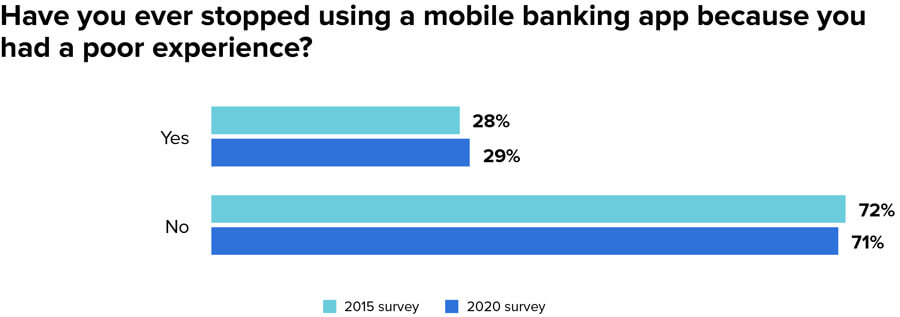
Those who say they’ve stopped using a mobile banking app because of a poor experience remained more or less constant, with 28% saying they had in 2015 and 29% saying they had in 2020. The question here is whether your organization is one of those whose users have stopped using your app, or whether your organization is one of those whose users have stayed. To find a quick clue: Look at your app ratings. More than 4.5? You’re probably doing well on this front. Less than 3? You’re likely one of the organizations people are fleeing from.
 MX Research, Survey of 1,010 random US consumers
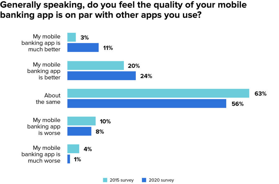
The question that saw the biggest swing was whether people feel like their mobile banking app is on par with the other apps they use. In 2015, only 3% of respondents said they either strongly agreed with the statement. That number almost tripled in 2020, hitting 11%. Again, this signifies that the industry has generally made tremendous progress on this front.
 MX Research, Survey of 1,010 random US consumers
Taken together, the state of user experience at financial services companies is clear: Things have improved over the past few years, but there’s still a long way to go — especially for those institutions lagging behind in mobile. In fact, if you’re not a clear leader in digital, you can see why you’re at risk to companies that are. People are distancing themselves from companies that don’t offer an ideal user experience.
So, how do you start turning things around?
It all begins with exploring user experience more deeply.
“Two-thirds of the decisions customers make are informed by the quality of their experiences all along their journey.” — McKinsey Research
More than anything, user experience is about the feelings you evoke in your customers as they interact with your brand. A good user experience generates positive feelings, which engenders loyalty over time. A bad user experience generates negative feelings, which generates distrust.
Because user experience is all about feelings, it’s more art than science. Think of a moment when you were wowed by a particular experience — perhaps the first time you used an iPad or the first time you quickly resolved a customer complaint online in chat. Whatever the specifics, you likely judged the experience by the emotions you felt when using the technology.
In light of this, it’s worth clarifying that when we talk about reimagining our digital future from the perspective of customers, what we’re really talking about is empathy — opening ourselves up to the emotions our customers are feeling moment to moment as they bank. Empathy is the core of all efforts to build the ideal user experience.
Because we’re talking about empathy and a process that is more art than science, it might be tempting to think that we’re talking about the look and feel of the digital experience — the skin on the surface. But that’s only a part of it. What we’re really talking about is outcomes.
Outcome-centered Design
At times it might seem like each department in your company is at cross-purposes. The legal and compliance aims for extreme caution while the innovation team wants to move faster. How do you ensure that everyone’s on the same page?
One way is by focusing on outcomes. As Jane Barratt, Chief Advocacy Officer at MX, points out, “You can have a great user experience that sets someone up for a 28% credit card rate, but that’s not a great outcome.” Along these same lines, if you offer an amazing interface but compromise security, you’ll end up with terrible outcomes when you inevitably suffer a data breach.
Barratt lists four questions to consider as you build an outcomes-driven organization:
By using these four questions as a guideline you’ll be well on your way to building an outcomes-driven organization.
The point here is to think of the outcomes your customers want most and focus everything around those outcomes. In other words, are you actually focused on what your customers want, or are you focused on what you think your customers want?

What Consumers Want
Consumer expectations have been shaped by the digital interactions they have with leading tech giants everyday. Google has redefined the idea of simplicity with an incredibly clean homepage that focuses on the task you want to do: search. Netflix and Facebook have reinforced the idea that it’s ‘all about me,’ by providing personalized experiences for each user. Amazon has demonstrated convenience through providing almost everything via quick delivery to their customers’ home. What’s so amazing about these tech giants is that they not only offer a simple and clear user interface for the consumer, but they’re also built on an incredibly complex back-end fueled with big data, algorithm, machine learning, and other technologies focused on optimizing the entire customer experience.
As Andres Wolberg-Stok, Global Head of Digital Policy at Citi, believes, “Customer expectations have changed. They used to be more understanding if certain features weren’t part of your mobile app, but now they expect to do whatever they want, whenever and wherever they want to do it.”
In order to find out how banks and credit unions can keep up, we spoke with Emilio Cristóbal Rubio, former SVP at Santander and current Country Director at Ashridge Executive Education. He says, “Customers are much more demanding these days. They’re connected at all times, which allows them to access their finances at any given point. They’re also very opinionated and do a lot of showrooming. But if they are engaged, they are 37% more profitable.” As consumers become more demanding, financial institutions need to completely reimagine the banking experience.

Throughout this ultimate guide, we’ve taken a deep dive into what people want as well as how you can go about laying the right foundation to meet their demands. We’ll end by giving five specific takeaways you can implement in your daily work right now. To do this, we use the design hierarchy of needs, which builds from functionality, reliability, and usability to proficiency and creativity.
By using the design hierarchy of needs as a standard to guide your organization, you can implement monumental changes where you work.
1. Functionality: Build on a Foundation of Security
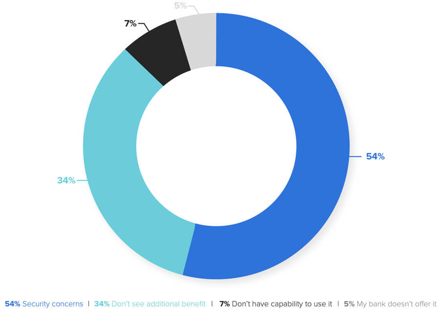
If you want to create the best user experience possible, you must offer a secure and confidential digital platform. According to NetFinance, security is by far the most common concern that non-mobile banking users have. They found that 80% of non-mobile banking users are concerned about identity theft. Furthermore, 54% of those who don’t use mobile banking don’t do so because of security concerns:
 Source: NetFinance
Security is only more pronounced when it comes to the digital account opening process. Javelin Strategy and Research shows that most people still favor the branch for data protection when opening an account. If bankers want high digital adoption rates, they must counter this perception so that consumers feel confident when directly signing up for digital products in part by making the digital onboarding process far easier. You can remove account holders’ concerns by not only building an easy experience, but by also demonstrating why the experience is secure through the use of third-party security icons and biometrics — and by keeping the flow of data collection short (i.e., ask nothing beyond what is absolutely needed).
2. Reliability: Create a Consistent Experience
Once a user is completely convinced their data is secure, they primarily care that their experience is reliable. If your institution offers remote deposit capture, you need to ensure the camera effectively takes a picture of that check and transfers the correct data points into the app (i.e. if the check is for $134.76, the check amount needs to show up as $134.76 in the app). If the app crashes, the picture doesn’t take, or if the actual amount is incorrect, the user will get frustrated and they’ll drop off quickly. Taking this a step further, if you look at the top 20 financial institution apps on the app store, the #1 complaint from account holders is ‘stability and crashing.’ In order to create a positive end-user experience and maintain a high level of app usage time, apps need to have a crash rate of less than 1%.
While most financial institutions have focused on making things work, the experience often ends up being clunky, slow and disjointed. This is problematic because consumers’ attention spans are getting shorter and shorter, with the average human attention span now being shorter than a goldfish’s. You can no longer provide days-long processing. You need to be focused on real-time. We live in an instant gratification culture, and your digital platforms must be very fast if you want to remain competitive.

3. Usability: ‘It Just Works’
Users demand simplicity. Steve Jobs understood this concept perfectly, as evidenced in Apple’s minimalist products and their “it just works” slogan. Users don’t want to have to learn how to do things over and over again. They want technology to do the heavy lifting for them. In fact 75% of consumers are more likely to recommend a brand because it provides a simpler experience.
As an example, traditional PFM didn’t take off because there was far too much upfront work for the user. The user had to compile their own budgets, enter in interest rates, etc. We found that once the work was done for them and users could instantly see budgets, debts, and trends from the past few months, adoption skyrocketed.
Another area to focus on is offering the right number of features while still making it easy for account holders. As usability expert Colleen Roller says, “For the most part, a person’s objective in decision making is to arrive at the best possible decision outcome with the least possible effort. Research shows that people are incredibly sensitive to even a minimal threshold of work or effort.”
In their digital account opening webinar, Javelin Research revealed that 75% of industry leaders say UX is the top problem that prevents people from opening an account digitally. Auto-populating information and rethinking the workflow goes a long way on this front, as does using the unique features of digital devices. For example, the camera can enable potential account holders to scan driver’s licenses or share supporting documents. Alternatively, biometrics and device recognition can authenticate applicants. In order to create a great user experience, financial institutions need to think through their account holders’ journey and determine how to make it as easy as possible for them. This is how to delight customers.
Data-Fueled Products
“Data is the great creator of experiences,” says Don MacDonald, CMO at MX. “It enables banks and credit unions to be Amazon rather than Sears.” He adds, “Behind all the customer experience data are people — people with expectations that the technology from their financial institution will be as helpful as the technology in their car or shopping experience. Good CX is not just a comparison to other financial institutions anymore but a comparison with Amazon, Tesla and Spotify.”
To truly deliver exceptional experiences and outcomes, you have to know your customers. And to truly know your customers, you must start with data. Data — particularly aggregated data — enables you to see which customers have accounts with your competitors, which customers are most likely to be looking for a loan, which customers are most in need of financial guidance, and much more.
If you’re looking to understand your customers, start with data.
While it is important that organizations stay true to their vision, data and insight should be used for feedback, testing and assessing account holders’ journeys. This data can help you make sure that everything is working just as you intended.
Do you know how many account holders abandon their journey if they’re applying for a new product online with you? Have you used A/B testing to test different messages and find out how you could improve the process? Every part of the user experience needs to be measured to optimize the design of the user experience. To do this, use the Lean Startup Methodology from entrepreneur Eric Ries, by which you implement an upward spiral of building, measuring, and learning to quickly achieve optimal results.
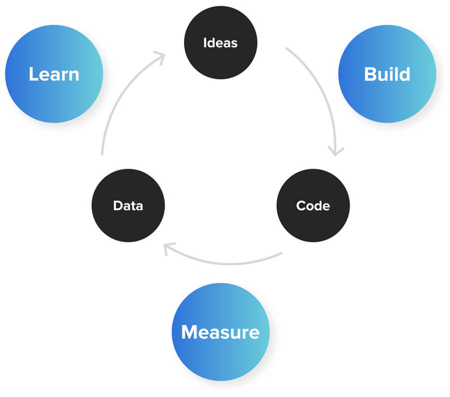 The Lean Startup Methodology
Data and customer insight should be used at each stage of the user journey to remove biases and uncover key design errors you might otherwise have missed.
“We developed our design in phases. Internally we called it an ‘interactive waterfall.’ As we completed each phase, we actually did extensive usability testing in our in-house lab, where we brought both prospective customers and actual customers to our lab to review the design and make sure they were resonating, both from a branding and a usability perspective.” - Carrie Sumlin, Digital Deposits Executive, Ally Bank
4. Proficiency: ‘Set and Forget’
Once you create a functional, reliable, and usable user experience, it’s crucial to consider what you can do to make everything more proficient. This is how you differentiate yourself in the market and drive new users your way. McKinsey Research shares that “companies must apply advanced analytics to the large amount of structured and unstructured data at their disposal to gain a 360-degree view of their customers.”
Automated Finance
Financial institutions want products that encourage longer sessions and provide power-users with every feature they seek, but they also want to make it easy for consumers to get in and get out as quickly as possible.
With the 24/7 connected consumer, financial institutions need to make sure their experience is as intuitive and easy as possible for account holders to get what they need at any time of the day. A large part of this convenience factor comes from offering automated processes. For instance, with bill pay, users can set automated payments with little effort. Having account holders set automatic transfers for savings is another example. Encouraging them to allocate ‘x amount per month’ to transfer between accounts means account holders can save without thinking.
“When I think about UX, I think about how quickly I can get our customer what they need. I want their experience to be quick and very easy to comprehend. I want to simplify the complexity as best as I can and let the customer move on with their day.” -John Schulte, CIO, Mercantile Bank
5. Creativity: A Beautiful, Clean Look
The majority of financial institution websites are filled with text, hyperlinks, drop-down menus, and scrolling display panels. It can often be overwhelming and paralyzing for the user.
On the flipside, if you look across leading tech sites such as Apple, you’ll see they are very clean, uncluttered and prioritize the information most relevant to what the account holder is looking for. When designing for the ‘Age of the Customer,’ your site needs to be unobtrusive, intuitive and as easy for the account holder as possible. A couple of trends that have emerged that make the user experience better are to allow for more information to appear as you scroll down a page (versus clicking next or going onto a new page). Another is the ability to use navigation keys on your keyboard to move left or right. To illustrate, when Ally Bank revamped their online banking site they took ideas from their mobile app including hidden menus and hidden navigations. This led to a clean experience that prioritizes the most important information.
UX all comes down to a single question: Do you want to delight account holders? If you do, then you need to provide a delightful experience — and delightful experiences are clean, easy and intuitive.
Beautiful Aesthetics
As financial services has become more competitive, it has become more and more commoditized. Furthermore, with outdated legacy systems and technical challenges, a customizable front end can be challenging. The end result is an unengaging interface that doesn’t differ much from competitors. You can look at almost every user interface in banking, and it is a list of forms, with the graphics and forms done in a very basic way.
With proper attention to aesthetics, you can change your app from boring to stunning.
Aesthetics is derived from the Greek word aisthetikos, which means “pertaining to sense perception.” Given that definition, your app’s aesthetics are essentially the messages communicated in sensory form — color, contrast, balance, proportion, movement, sound — as opposed to strict logic. Application design cannot be thought of as simply organizing design elements (lists, buttons, rows etc.), rather the organization of those elements must be informed by core design principles.
Examples of Beautiful User Design
N26
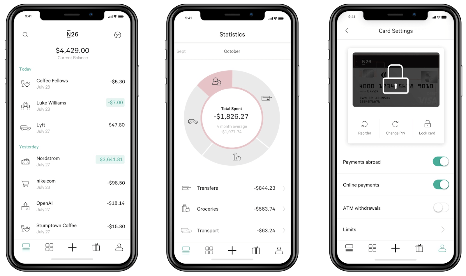 Viewing transactions and card settings in N26.
Wealthfront
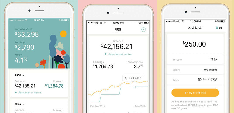 Checking portfolio value and funds in Wealthfront.
America First Credit Union (Using the MX Helios Framework)
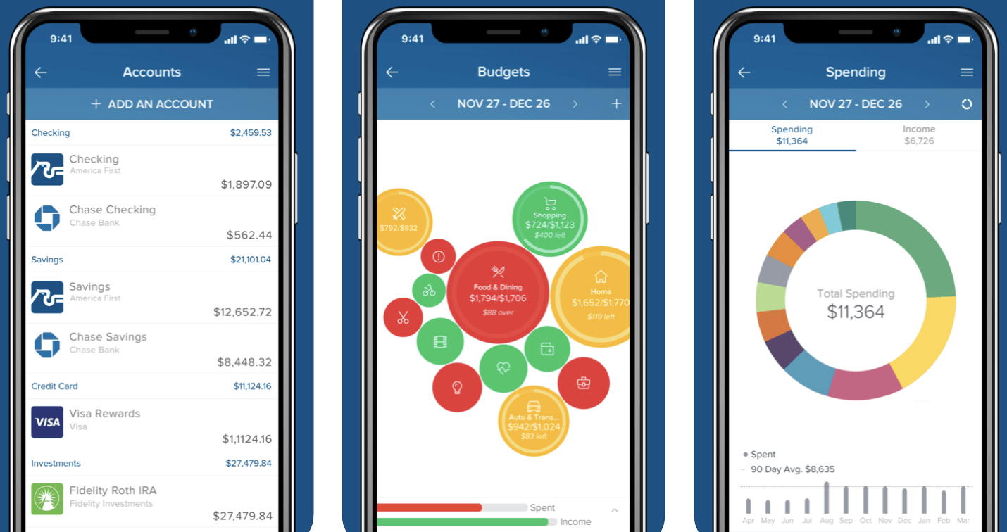 Analyzing spending patterns in America First Credit Union.
The importance of a good design aesthetic comes down to credibility. Users draw a nearly instantaneous conclusion about the credibility and quality of your product based on the quality of your overall design. Like it or not, design and aesthetics have a profound impact on how users perceive information, learn, judge usability, and ultimately assign value to a product. No longer can companies dismiss design as merely visual. It is core to an engaging experience. Style does not replace substance — but your app is more potent when substance and style are in harmony.
Ask yourself:
Pay attention to your feelings as you interact with your app while asking these questions, and don’t hesitate to find other people to test things out as well. The point is to develop a sensitivity to the users of your products.
As mentioned throughout this white paper, it’s incredibly important to get the foundation right. By way of analogy: when you build a house you have to make sure you start with solid plans since paint and drywall (UI) are a lot easier to swap out than a failed foundation. The same applies to banking. Once the essentials are in place and you have the right foundation of security and stability, then you can start to create more of a beautiful look and feel for your digital channels. You want to create an experience that is positive, that encourages consumers to engage more and ultimately manage their finances better — starting with a service point of view (e.g., what is most important to the customer) and then building toward a product feature point of view.
To conclude, if you want to offer the right user experience you should focus on outcomes. Follow the design hierarchy of needs, building from functionality, reliability, and usability to proficiency and creativity.